Captivating Visualization Power of lets-plot
Hi, fellow data enthusiasts! Today, we’re setting sail on a delightful journey to explore the world of data visualization with lets-plot Python package, a captivating gem, by JetBrains, inspired by the legendary ggplot2 from the R universe. If you’re tired of bland and dull plots that make you yawn louder than a bear in hibernation, fear not! lets-plot is here to save the day with its elegance, versatility, and charm. So, hoist your Python flags high and let’s embark on this hands-on adventure!
tl;dr
Check out the Bonus section!
Setting Sail with lets-plot
The beauty of lets-plot lies in its simplicity. To get started, ensure you have lets-plot and pandas installed:
pip install lets-plot pandas
Then, import them:
import pandas as pd

from lets_plot import *

LetsPlot.setup_html()
With lets-plot and pandas on board, we’re ready to work our magic on visualizations!
Data Preparation
Before we dazzle our eyes with mesmerizing plots, we need some data to play with. In the first part of this tutorial, we’ll use a swashbuckling dataset of pirates and their treasure loots (available here). To import the data, we’ll rely on the trusty pandas library:
# Load the dataset
df = pd.read_csv("data/pirate.csv")

df
| ship_name | ship_type | age | plunder | |
|---|---|---|---|---|
| 0 | Blackbeard's Revenge | Galleon | 32 | 50000 |
| 1 | The Salty Sea Serpent | Frigate | 28 | 42000 |
| 2 | The Crimson Corsair | Sloop | 24 | 30000 |
| 3 | Calico Jack's Jewel | Galleon | 36 | 65000 |
| 4 | The Jolly Roger | Frigate | 22 | 38000 |
| 5 | The Sea Serpent | Sloop | 27 | 32000 |
| 6 | Captain Hook's Revenge | Galleon | 40 | 70000 |
| 7 | The Flying Dutchman | Frigate | 35 | 48000 |
| 8 | The Shadow Shark | Sloop | 30 | 35000 |
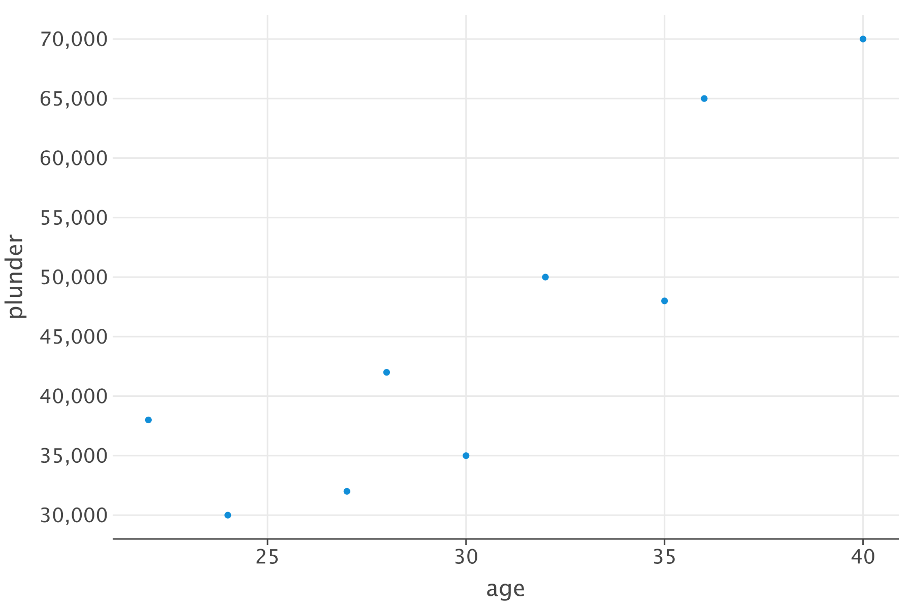
Basic Plotting
Behold the simplicity of lets-plot! Creating stunning plots is a piece of cake. Let’s start with a scatter plot to visualize the relationship between the pirates’ plunder and their age:
# A basic scatter plot
p = ggplot(df) + geom_point(aes(x="age", y="plunder"))

# Show the plot
p.show()
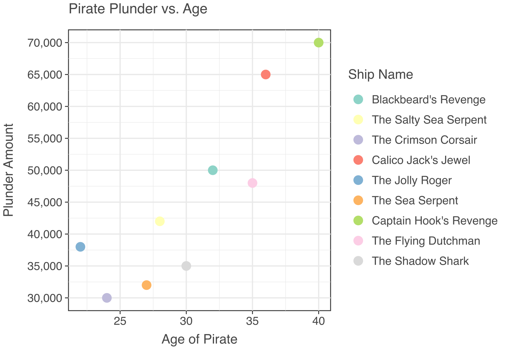
Customizing the Plot
Our plot might be functional, but it needs some flair, a touch of customization to make it truly memorable. Let’s spice things up with a pirate-worthy title, axes labels, and some eye-catching aesthetics:
# Customizing the plot with labels and colors
p = (
    ggplot(df)
    + geom_point(aes(x="age", y="plunder", color="ship_name"), size=5)
    + labs(
        title="Pirate Plunder vs. Age",
        x="Age of Pirate",
        y="Plunder Amount",
        color="Ship Name",
    )
    + theme_bw()
    + theme(text=element_text(family="Helvetica"))
)

# Show the upgraded plot
p.show()
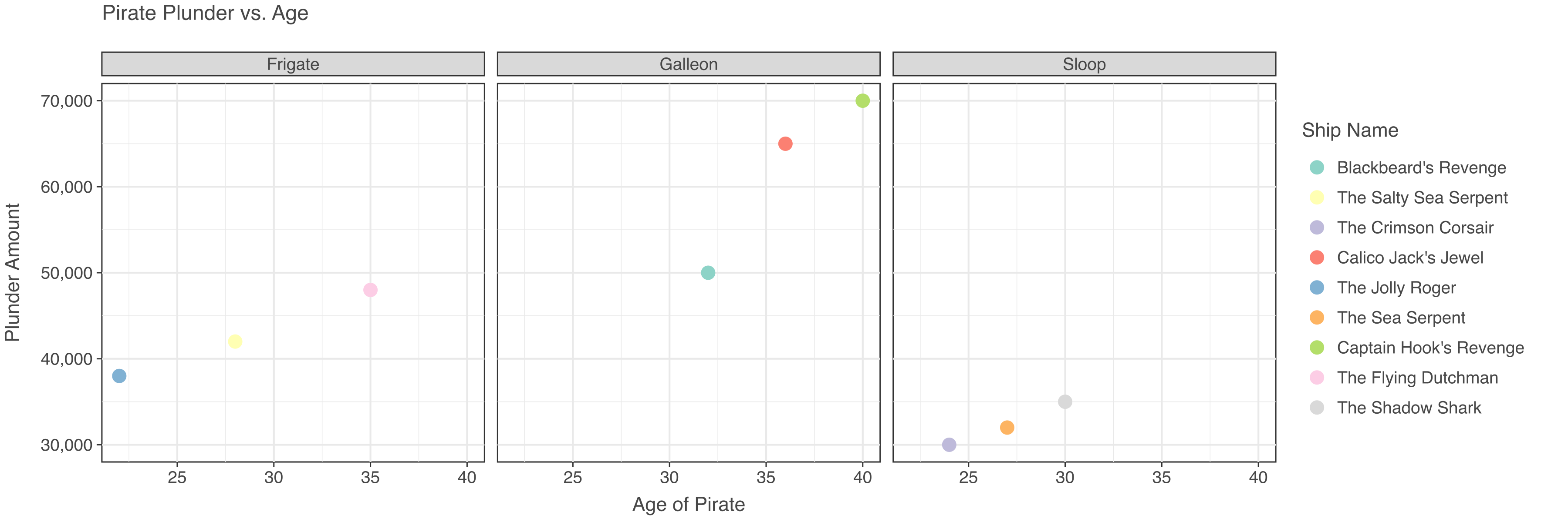
Faceting
Want to create a series of plots for different ship types? Faceting is the answer! Check out this neat trick:
# Faceting the plot by ship type
p = (
    ggplot(df)
    + geom_point(aes(x="age", y="plunder", color="ship_name"), size=5)
    + labs(
        title="Pirate Plunder vs. Age",
        x="Age of Pirate",
        y="Plunder Amount",
        color="Ship Name",
    )
    + facet_wrap("ship_type", ncol=3)
    + theme_bw()
    + theme(text=element_text(family="Helvetica"))
)

# Show the faceted plot
p.show()
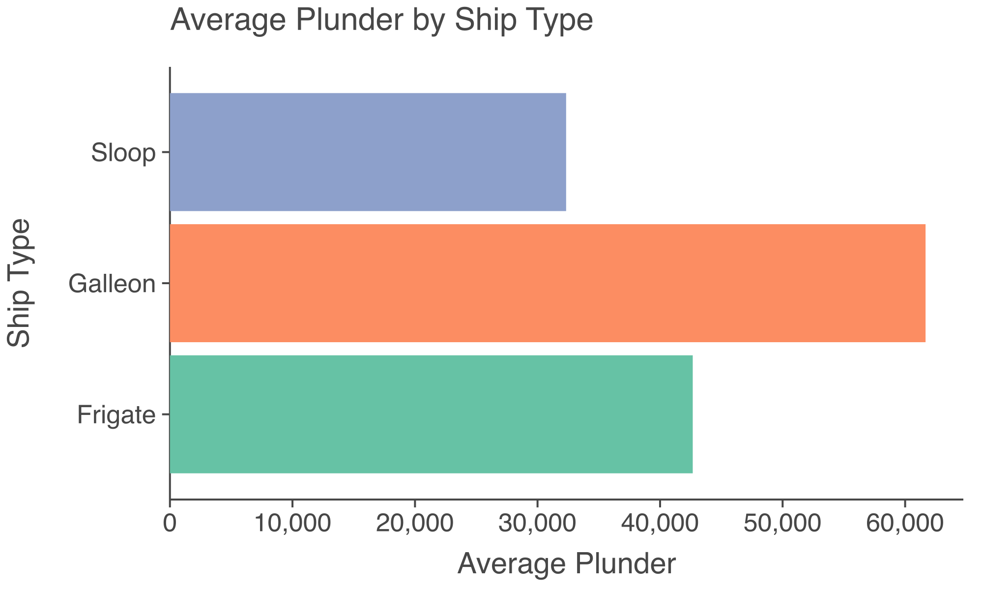
A Dash of Bar Charts
Now, it’s time to delve into bar charts. Let’s visualize the average plunder by each ship type:
# Data
df_bar = df[["ship_type", "plunder"]].groupby("ship_type").mean().reset_index()

# Creating a bar chart for average plunder by ship type
p = (
    ggplot(df_bar)
    + geom_bar(
        aes(x="ship_type", y="plunder", fill="ship_type"), stat="identity"
    )
    + coord_flip()
    + labs(
        title="Average Plunder by Ship Type",
        x="Ship Type",
        y="Average Plunder",
    )
    + theme_classic()
    + theme(text=element_text(family="Helvetica"), legend_position="none")
    + ggsize(500, 300)
)

# Show the bar chart
p.show()
Bonus
Now, check out some complicated plots!
The datasets are available here.
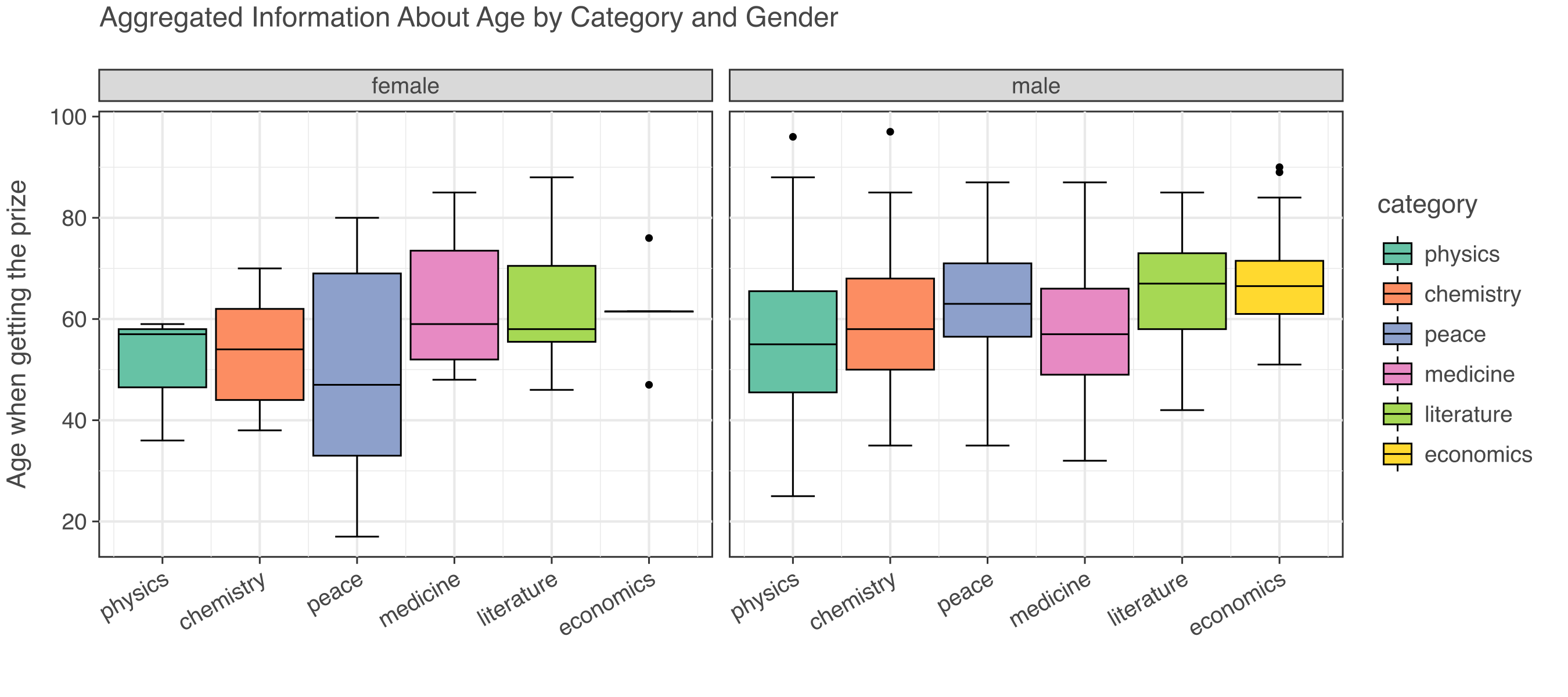
# Data
df = pd.read_csv("data/nobel_final.csv")

# Plot
p = (
    ggplot(df)
    + geom_boxplot(aes(x="category", y="age_get_prize", fill="category"))
    + facet_grid(x="gender")
    + ggtitle("Aggregated Information About Age by Category and Gender")
    + labs(x="", y="Age when getting the prize")
    + theme_bw()
    + theme(text=element_text(family="Helvetica"))
)

p.show()
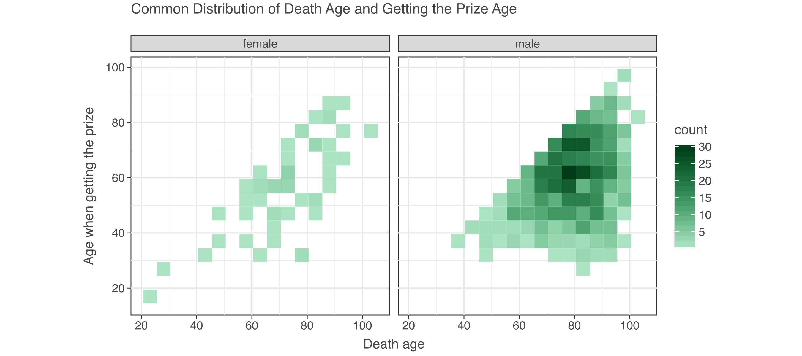
# Data
df = pd.read_csv("data/nobel_final.csv")

# Plot
p = (
    ggplot(df, aes(x="age", y="age_get_prize"))
    + geom_bin2d(binwidth=[5, 5])
    + scale_fill_gradient(low="#ace3c2", high="#013b18")
    + facet_grid(x="gender")
    + ggtitle("Common Distribution of Death Age and Getting the Prize Age")
    + labs(x="Death age", y="Age when getting the prize")
    + theme_bw()
    + theme(text=element_text(family="Helvetica"))
    # + ggsize(500, 300)
)

p.show()
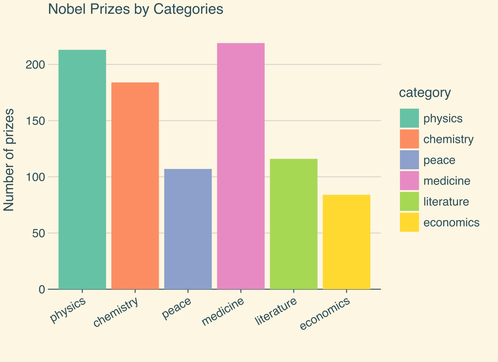
# Data
df = pd.read_csv("data/nobel_final.csv")

# Plot
p = (
    ggplot(df)
    + geom_bar(aes(x="category", fill="category"))
    + ggtitle("Nobel Prizes by Categories")
    + labs(x="", y="Number of prizes")
    + theme(
        text=element_text(family="Helvetica"),
        panel_grid_major_x=element_blank(),
    )
    + flavor_solarized_light()
    + ggsize(550, 400)
)

p.show()
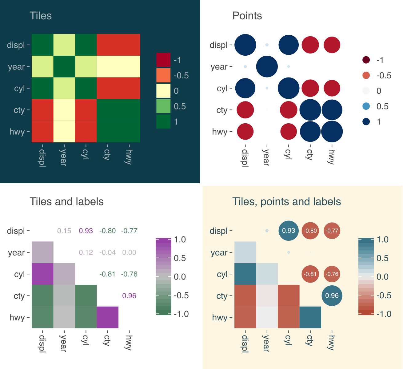
from lets_plot.bistro.corr import corr_plot

# Data
df = pd.read_csv("data/mpg.csv")

# Plot
corr = corr_plot(df)
nice_font = theme(text=element_text(family="Helvetica"))

p1 = (
    corr.tiles().palette_RdYlGn().build()
    + ggtitle("Tiles")
    + nice_font
    + flavor_solarized_dark()
)

p2 = corr.points().palette_RdBu().build() + ggtitle("Points") + nice_font

p3 = (
    corr.tiles()
    .labels()
    .palette_gradient(low="#417555", mid="lightgray", high="#963CA7")
    .build()
    + ggtitle("Tiles and labels")
    + nice_font
)

p4 = (
    corr.points().labels().tiles().build()
    + ggtitle("Tiles, points and labels")
    + nice_font
    + flavor_solarized_light()
)

p = gggrid([p1, p2, p3, p4], ncol=2) + ggsize(600, 550)

p.show()
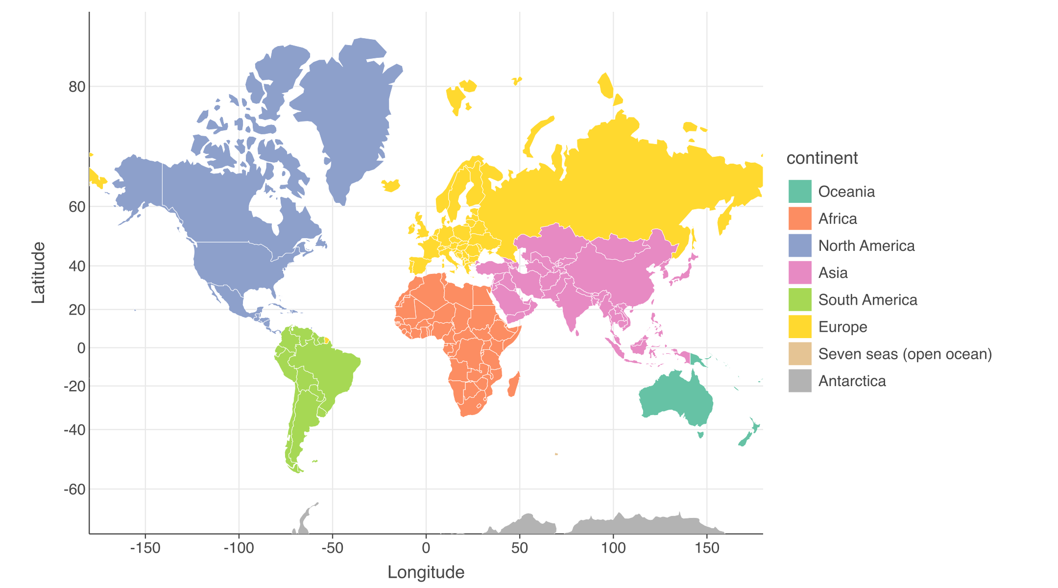
First, install “geopandas”, then run the Python code.
pip install geopandas
# Data
import geopandas as gpd

world = gpd.read_file("data/world.gpkg")
world_limits = coord_map(ylim=[-70, 85])

# Create a choropleth by mapping the continent variable to the fill aes.
p = (
    ggplot()
    + geom_map(aes(fill="continent"), data=world, color="white")
    + world_limits
    + labs(x="Longitude", y="Latitude")
    + theme(
        text=element_text(family="Helvetica"),
        axis_line_y=element_line(),
    )
    + ggsize(900, 500)
)

p.show()
Conclusion
With lets-plot in your Python arsenal, data visualization becomes a thrilling voyage rather than a tedious journey. Inspired by R’s ggplot2, this delightful package brings charm, ease, and beauty to your plotting adventures. So, hoist your Python flags high, unleash your creativity, and chart a course to mesmerizing visualizations. May your plots be as captivating as the tales of legendary pirates!
Happy plotting, and may the seas of data always be in your favor! 🌟✨